Queen's Studio
- Project Code18/025
- ClientNewmark PI
- LocationQueen's Park
- Size23,000 sq ft
- SectorMixed Use - Commercial and Retail
- StatusComplete
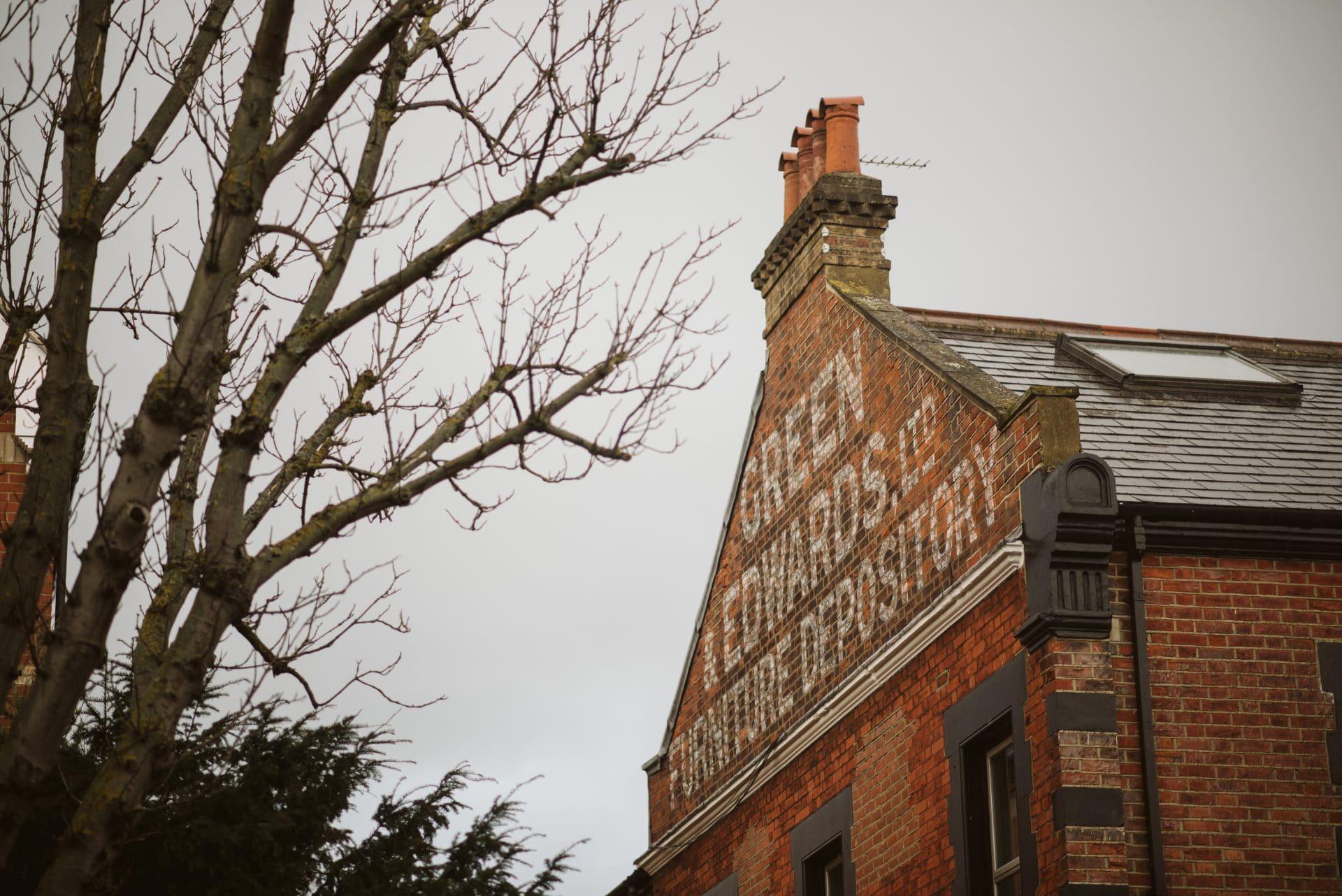
Queen’s Studios has always had character in ample supply but by collaborating with our enthusiastic client through an iterative process, we ensured the building’s charisma was not just evident but abundant through an interactive process.
Queen’s Studios has always had character in ample supply but by collaborating with our enthusiastic client through an iterative process, we ensured the building’s charisma was not just evident but abundant through an interactive process.
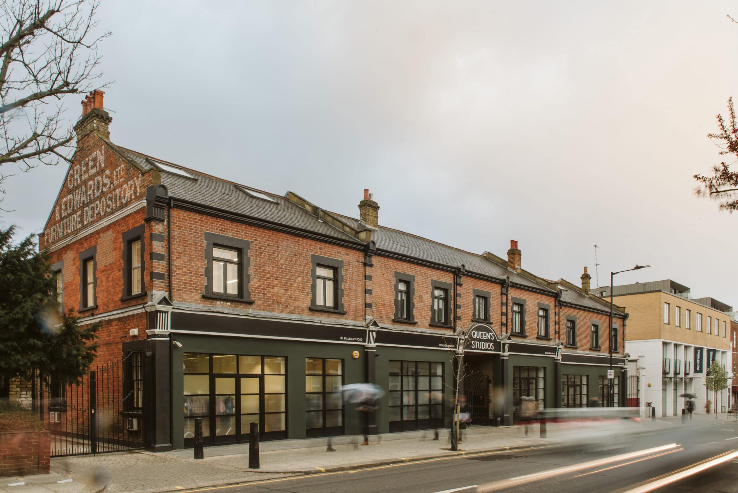
A palette of deep green and brick, accented by thin black detailing and plentiful glazing, retains the building’s charm and revives a touch of art deco elegance.
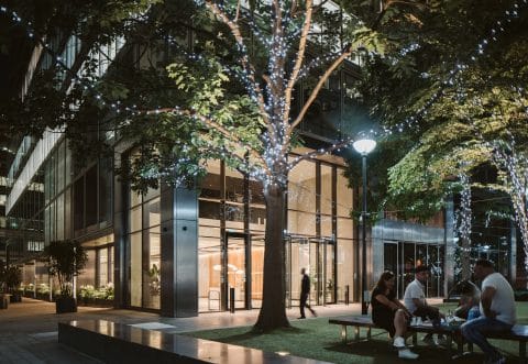
Remodelling the frontage to include full-height glazing inspires activity and flow and creates lucrative retail opportunities on a busy street. An intentionally flexible space, the ground floor design scheme was ideal for the combined retail and café tenant who took the space.
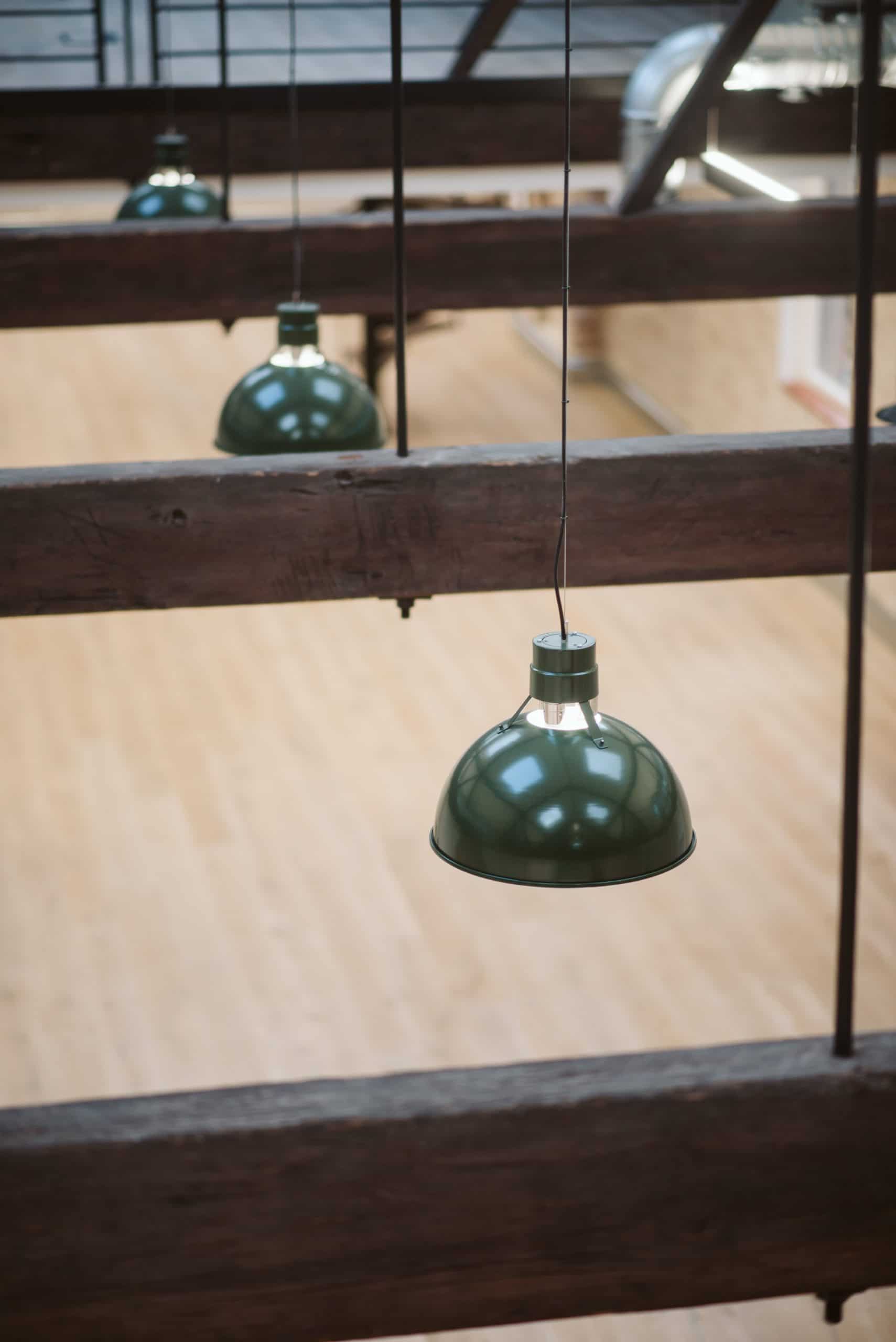
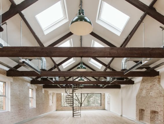
Inside, a character-filled reception featuring a brand-new metal staircase draws you further into the building. Rich wooden accents, blasted and washed brickwork, and suspended feature lighting combine to emphasise the triple-height entrance space.
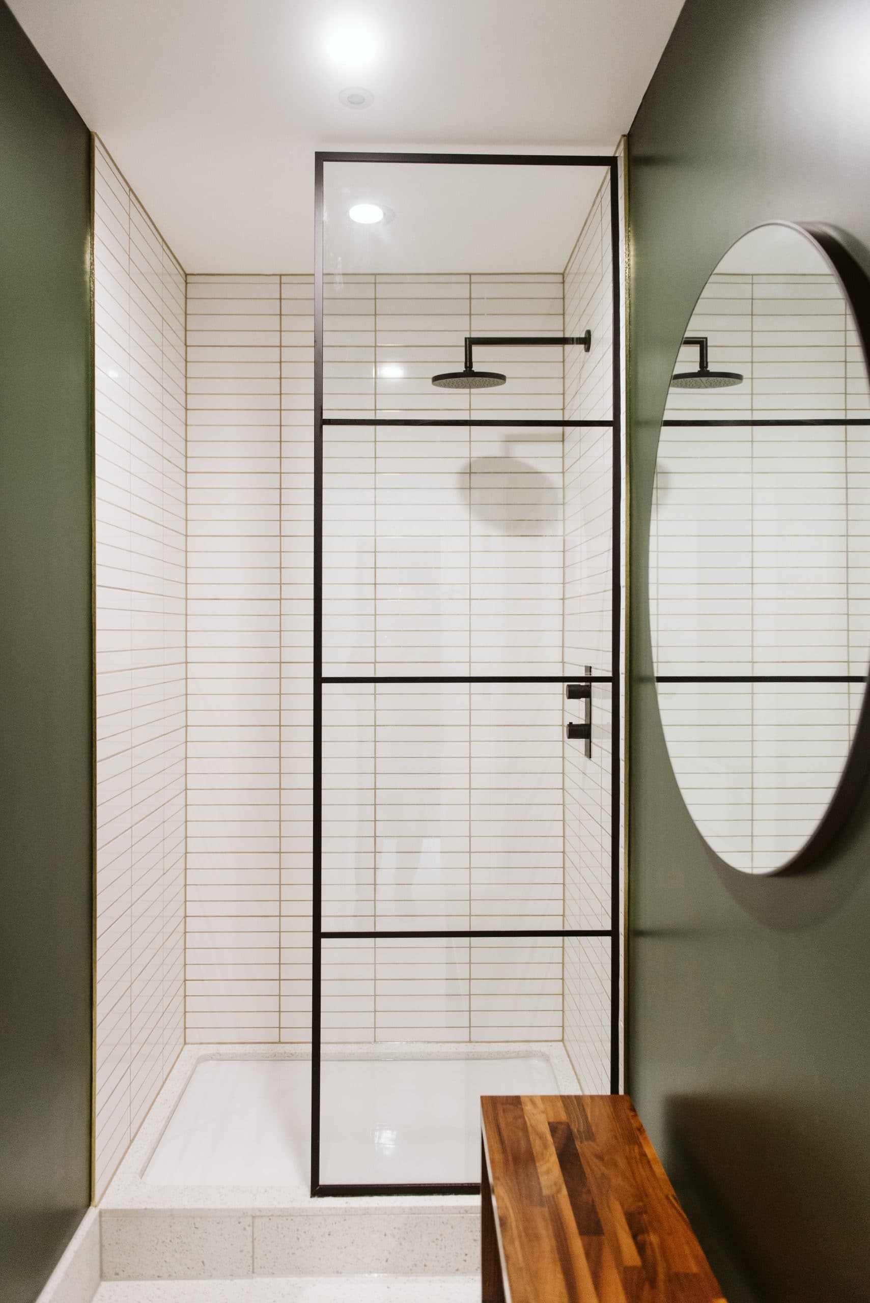
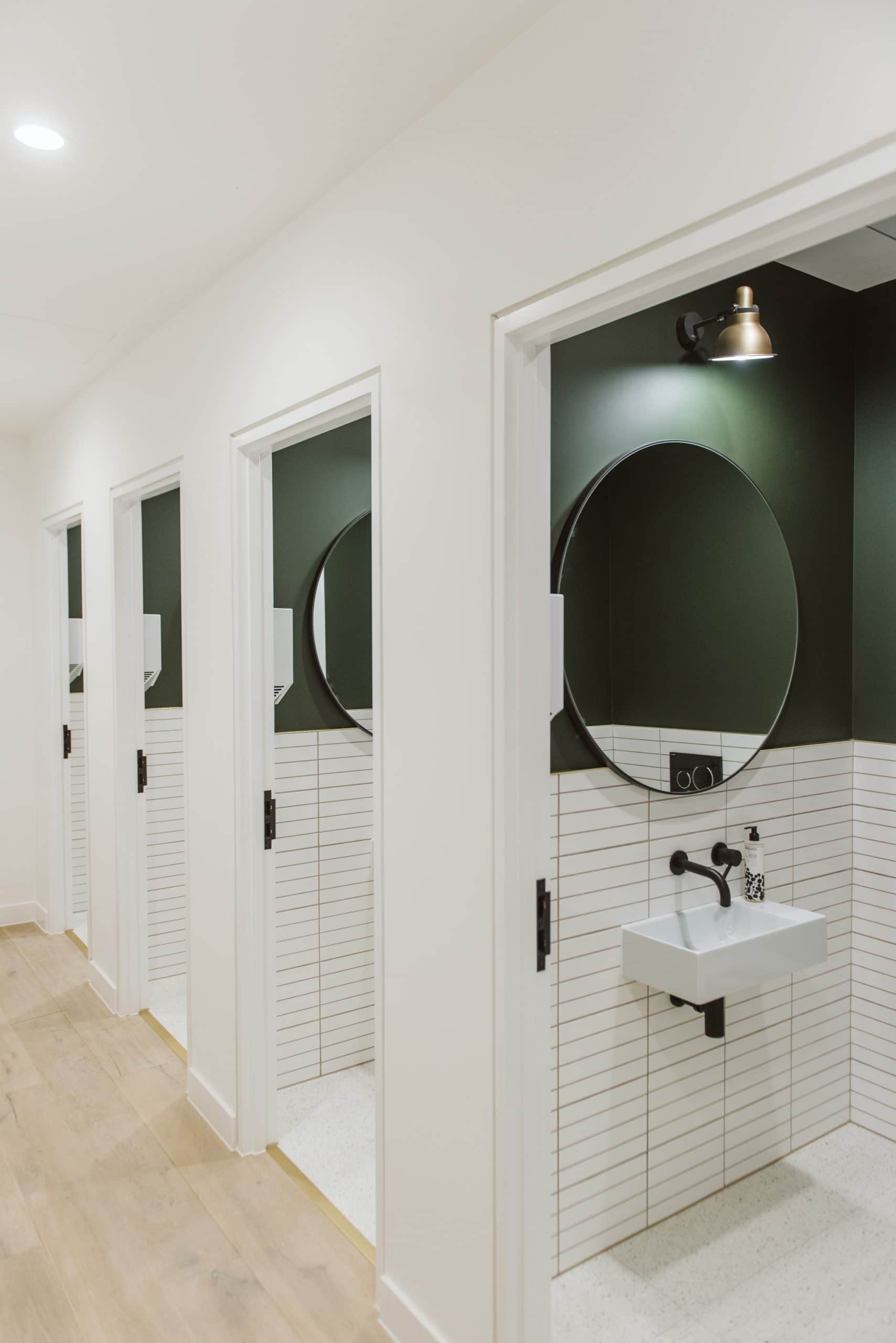
Throughout the Cat A refurbishment, human-centric design choices put the user first without needing to define a specific occupant. This included a complete mechanical and electrical upgrade for year-round comfort, brand new showers and cycle facilities, upgraded floor finish, bridging and planting in the central atrium, and all new WCs, detailed in forest green and stack bonded slim tiling. The palette introduced in the building’s façade echoes through each area, in significant features and small details alike.
The space immediately attracted interest from all sorts of tenants, completing the transition from furniture depository to sought-after commercial space mere minutes away from central London.
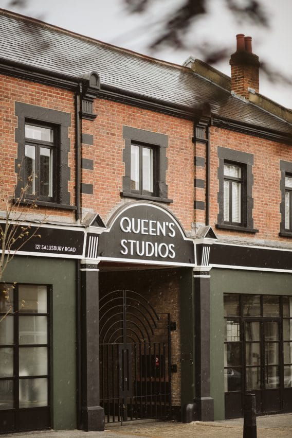


"The building had all the bones of an incredible street facing scheme, it just unfortunately wasn't engaging it in the right way. The client decision to invest in creating the street facing units either side of the main entrance was an instant success with a retailer and boxing gym quickly taking occupation"
Liam Spencer
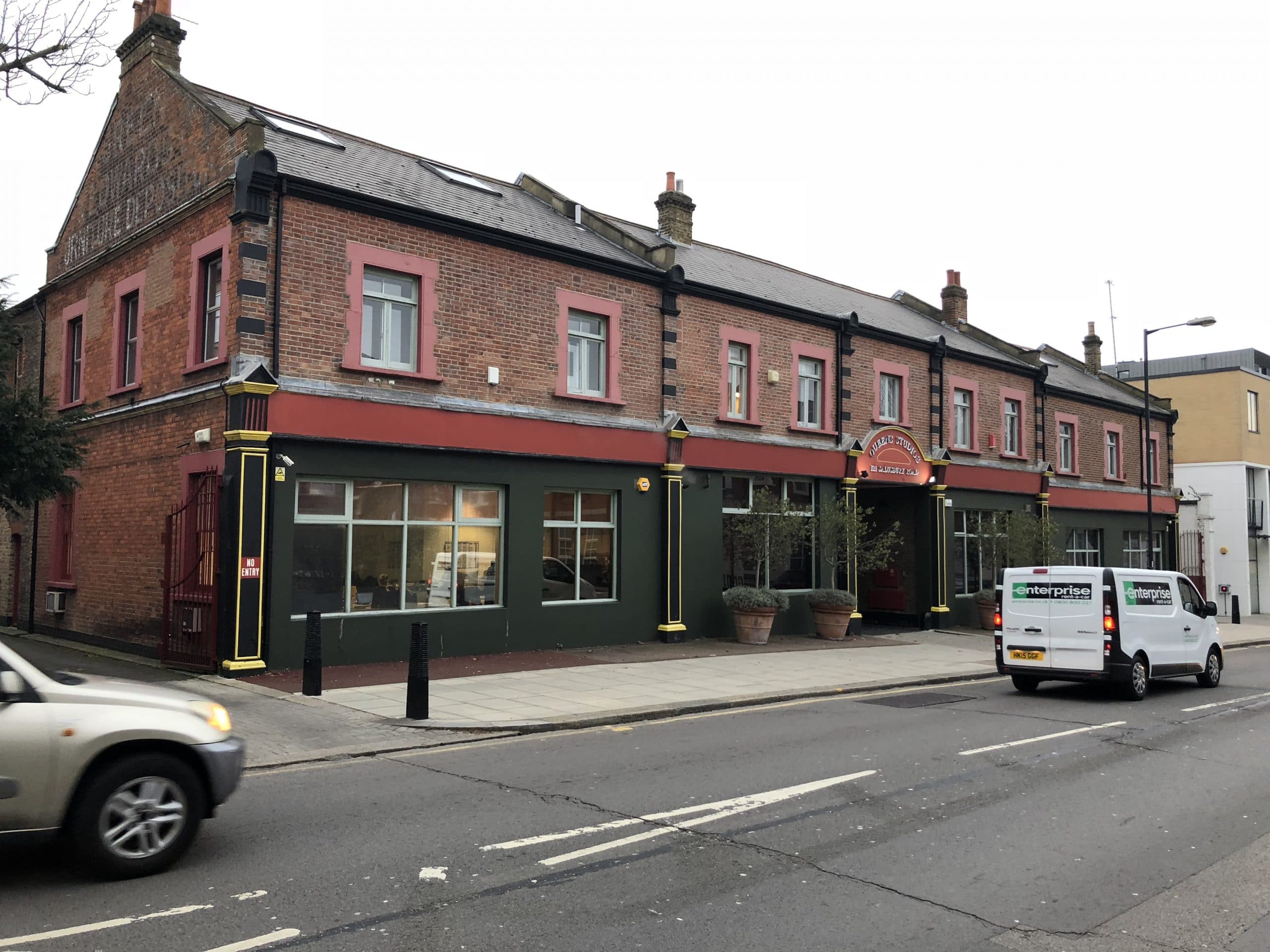
"This was a project about commercially aware transformation. The little details and touches went a long way; from the shower and WC palette through to the use of the forest green pendant lights in the main spaces.
Without a doubt the biggest transformation was the reception space - the bizarre and heavy wooden staircase was removed in place of a light metal stair which ultimately becomes part of the reception joinery at the ground floor. It is still one of my favourite concepts as the final product stayed so true to the initial design and CGI intent."Amy Martin
